Context
MinuteClinic delivers convenient, accessible care to millions of patients nationwide each year. However, its outdated online scheduling experience led to high patient drop‑off. To support patients using digital scheduling and drive a digital-first approach, the business prioritized modernizing the platform to reduce abandonment and improve the overall user experience.
Outcome / Impact
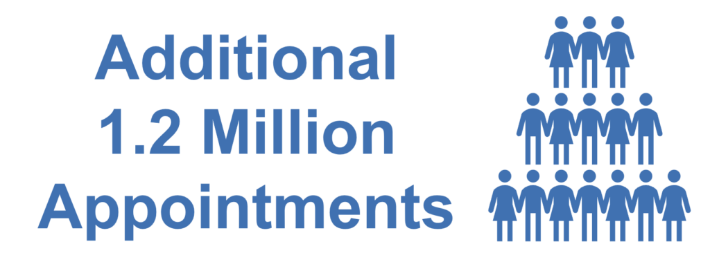
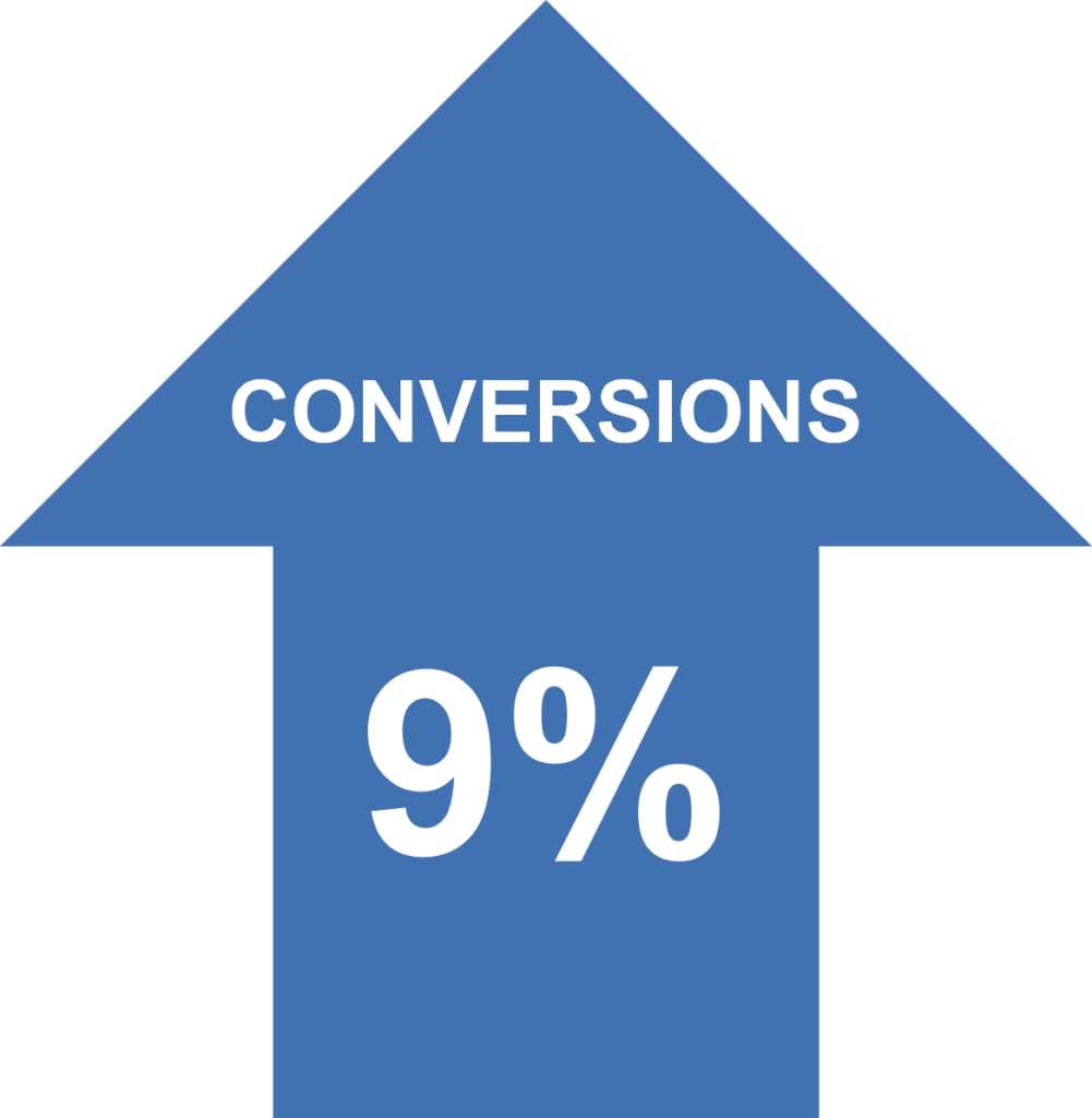
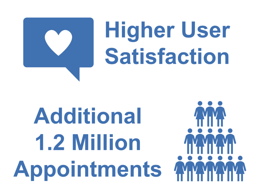
Removed friction in finding available appointments to improve the scheduling experience for 5 million+ patients, increasing conversions by 9% for 1.2 million additional appointments.

My Role
- Senior Product Designer for redesign and enhanced usability for Appointment Picker pages.
- Cross-functional strategy partner, balanced user needs, business goals, and technical feasibility to align design strategy.
- End-to-end design process, focused on user research, iterative design from wires through high fidelity screens, realistic prototyping and usability testing.

Problem / Challenge
The existing Appointment Picker had a 53% drop-off rate, causing significant patient abandonment and lost conversions. With leadership pushing for a quick win to support a digital‑first strategy, reducing churn and improving online conversion became a critical priority.
Understanding MinuteClinic Patients
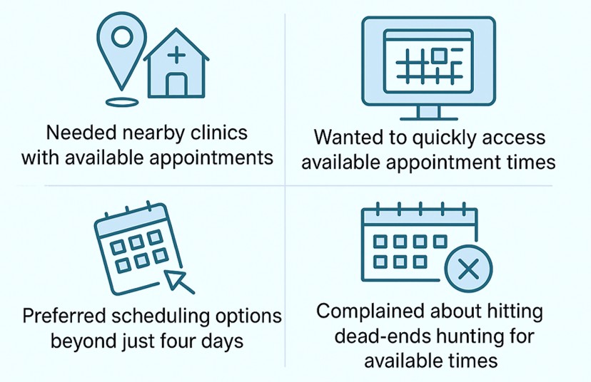
Voice of the Customer feedback exposed scheduling pain points: limited options, time-consuming searching, and time slot dead-ends.
Mapping an improved patient scheduling flow
Defined patient journeys and wireframed Appointment Picker screens to drive cross‑functional alignment.
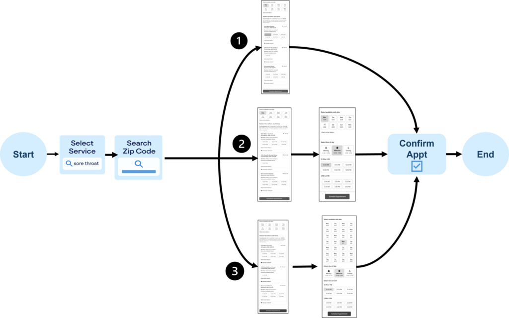
(1) Patient Selects Service > Searches by Zip Code > Selects an Available Date > Selects an Available Time on a clinic location card > Confirms Appointment
(2) Patient Selects Service > Searches by Zip Code > Clicks View More Dates > Selects an Available Date > Selects an Available Time of Day > Selects an Available Time > Confirms Appointment
(3) Patient Selects Service > Searches by Zip Code > Clicks Views more dates > Expands Available Dates > Selects an Available Date > Selects an Available Time of Day > Selects an Available Time > Confirms Appointment
Appointment Picker Redesign:
Clinic List Page
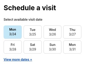
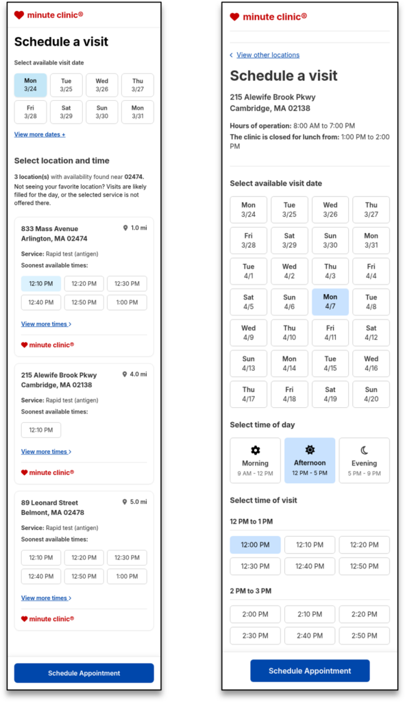
Eliminated dead‑ends by showing only available dates: optimized with 8‑date limit for speed and clarity.
- Showing only date options where appointments are available at clinics to solve friction of clicking dates and times and hitting dead-ends (no appointments).
- Aligned early with developers that we would display no more than 8 dates and 6 time slots per clinic on page load. Both reduced cognitive overload for users and was optimal for page load times.
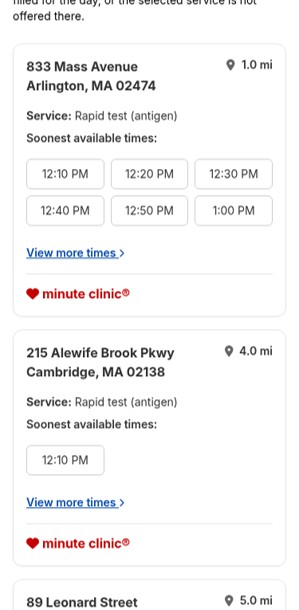
Surfaced only clinics with available appointments, prioritized by 10‑mile radius, closest distance, and soonest available times to improve patient convenience.
Only clinics with available appointment times on selected date are displayed to solve pain point of clicking times and hitting dead-ends (no appointments).
Alignment with business stakeholders and developers to balance ideal search radius (10 miles) to populate clinic list.
Aligned with product and business that clinics listed by closest distance from zip code for patient convenience.
Times displayed on clinic cards by soonest available. Patients can easily explore more available times (View more times > links) on the clinic details page.
Appointment Picker Redesign:
Displaying expanded dates view
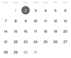
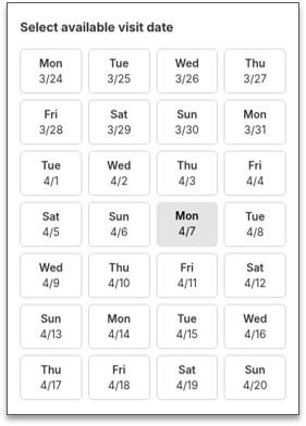
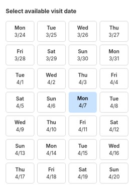
Chose 28‑Day Expanded Date Picker over calendar view, ensured accessibility now & roadmapped calendar view for future release.
- Explored a calendar view vs. expanded date picker.
- There were technical concerns about being able to provide a fully accessible experience with the calendar view given the time we had to deliver.
- We opted for an expanded 28-days date picker and placed calendar view on our roadmap for a future release.
Calendar view
Expanded Date Picker
Appointment Picker Redesign:
Clinic Details Page
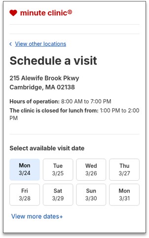
Improved scheduling clarity by limiting results to available dates at the selected clinic and introducing expanded options that deliver the patient‑requested flexibility.
- Showing only date options where appointments are available at the selected clinic to solve pain point of clicking dates and times and hitting dead-ends.
- Patient can view more dates and select from days with available appointments, meeting user needs to have scheduling options beyond four days
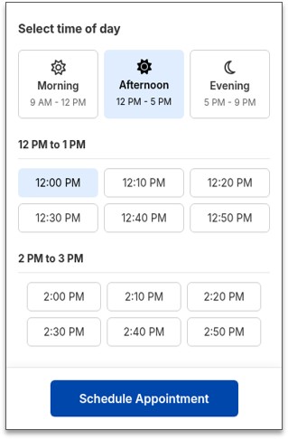
Structured appointment times into intuitive Morning, Afternoon, and Evening groups, elevating usability and accessibility while simplifying patient decision‑making
Display times by Morning, Afternoon, & Evening to provide better usability.
- Times are easily scannable to find preferred time faster.
- Meets higher accessibility standards for reducing cognitive load.
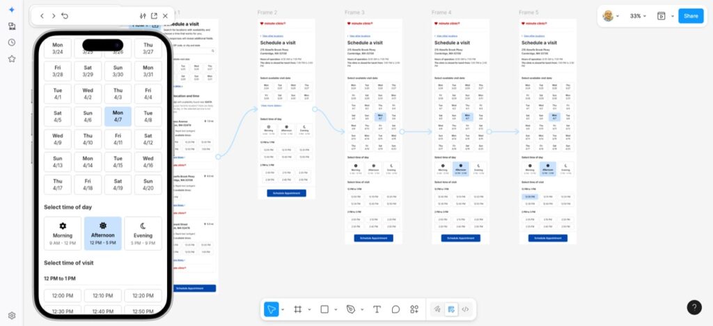
Prototype & Testing with MinuteClinic Patients
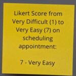
Built an interactive prototype and led moderated usability testing with diverse MinuteClinic patients that validated design direction and surfaced features for our roadmap.



Outcome / Impact
Removed friction in finding available appointments to improve the scheduling experience for 5 million+ patients, increasing conversions by 9% for 1.2 million additional appointments.

Influencing the Roadmap
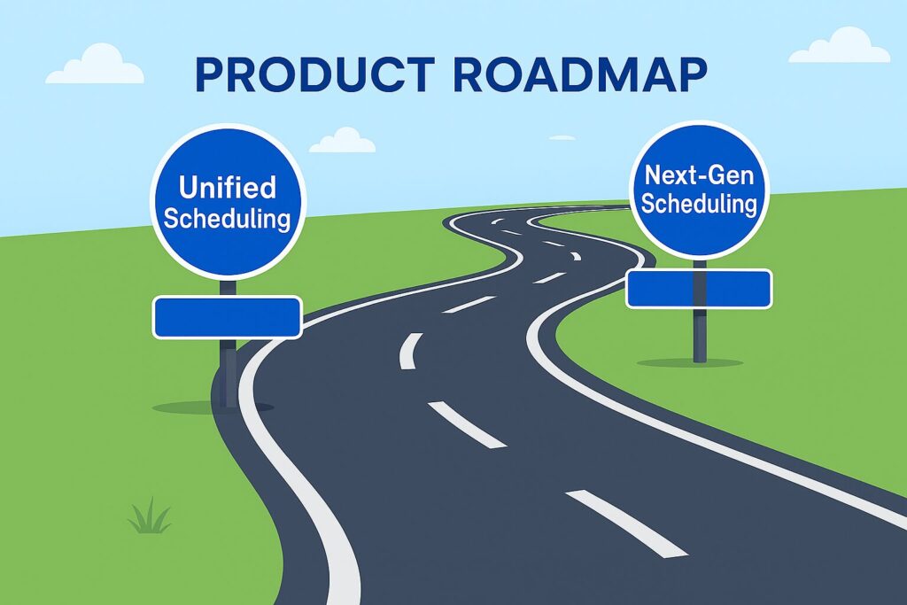
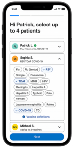
The appointment‑picker redesign evolved into the foundational pattern for Unified Scheduling, where I served as Lead Product Designer, and Next‑Gen Scheduling for the CVS Super App, where I led the team as a Player/Coach Design Manager. Our learnings carried forward in features we would build for those experiences.
Let’s build great products together!
Jay Lawlor
Senior Product Designer

View other case studies
A Better Way to Book: Redesigning MinuteClinic’s Appointment Selection
From Siloed to Seamless:
Designing CVS Health’s Unified Scheduling Platform
Streamlined for Scale:
Designing CVS Super App’s Personalized Scheduling

